Reformed Fire
A new book called Tulips on Fire by my friend and fellow minister Ben Zornes . . .
Please Ponder
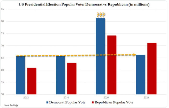
I am going to be writing about this in detail on Monday, but would ask you to stare at it for a bit right now, and to meditate on the clear implications. This will help prepare you to understand why I intend to uncork.

So Nice

Almost There

A Song I Really Like for Some Reason
I Know, Right?

HT: Samuel Cherubin

Palmaerts Roland
Featured Product

Proof as Moral Obligation
This book is dedicated to my son Nate, who was the first person I ever heard describing proof as establishing a moral obligation. This struck me immediately as being exactly correct, and it was something which fit neatly into my presuppositional understanding of knowledge and epistemology. This obviously has enormous ramifications for Christian apologetics, and so this small book is presented i…


One thing I learned from “How To Lie With Statistics” by Darrell Huff, (1954) (a great read!), is that the Y axis of such a graph _must_ start at 0.
In your analysis, please include a correctly presented graph of that data (even if you include the provocative form from the meme too).
Yup. Also keep in mind that they mailed out ballots because of covid. People didn’t have to stand in line or get off work or any of the usual in many states. If turnout wasn’t massively higher that year, i’d be shocked.
Thanks for pointing that out. It’s so easy to miss!
And also remember that this graph was based on figures when there were still roughly 13-14 million votes outstanding due to the preposterously slow counting of votes in California, Utah, Arizona, and other such states.
Agree with E and Rudolf. This graph is misleading… “There are three kinds of lies: Lies, Damned Lies, and Statistics.” In addition, the 2024 bars do not contain 100% of the votes. Would love to see these graphs (y axis starting at 0) when we get to 100%. I remain unconvinced that 2020 was stolen and these careless posts only strengthen this conviction. Please be honest and I am willing to be persuaded.
Looking forward to Monday… But note where the y-axis begins; check that current vote numbers are included (and not just the votes when that meme was created). Consider the jump in Republican votes – not as much as Democrat voters, but still significant (was one of the mechanisms of cheating the enabling of many people to vote many times, and both Democrats and Republicans availed themselves of the opportunity?) Consider the unique circumstances of 2020 – lots of people at home, with nothing to do but watch T.V. be brainwashed and submit the mail in ballot. On the other hand… Read more »
Yes, all that will be budgeted for . . .
Some clear implications I can think of include…. 1) On the face of it, you might suggest that Joe Biden was significantly more popular with those open to considering voting Democrat in a presidential election than Hilary Clinton or Kamala Harris were. 2) Though, it’s also clear that someone blundered by creating a graph when there were still at least around 8 million votes to be counted/included, and someone else blundered by taking that graph and republishing it without minimal-competence checking of the situation first. 3) It’s, at the beginning to someone who’s not done a little study of statistics,… Read more »
That meme is unfortunately very misleading: the popular vote counts for 2024 are currently at 70.4m vs 74.3m with approximately 4m uncounted for Harris and 3m uncounted for Trump. This puts us at almost the same voter turnout as in 2020. In 2020 66.6% of eligible voters voted, in 2024 64.5% did.
I think the likely scenario is both elections involved a large amount of fraud from the Left. However, padding the numbers can only do so much when there’s no real movement behind Harris.