Introduction
I want to begin by explaining what I believe to be the import of a graph that I saw circulating last week, and which I also retweeted—while asking folks to stare at it while meditating thoughtfully. Now that was too quick and too glib for some needed context, which I want to provide now, and so apologies for the lateness. But in the title here I still call it a “damning graph,” and so I want to explain in greater detail why I can still call it that, even after noting a couple of problems with it.
But a quick note before proceeding, and a couple of qualifications. Because these are so clearly qualifications, and because I am writing this in what is supposed to be NQN November, this post had to be demoted from my regular Monday post which will immediately follow this one—and that one will be qualification free. This one was going to be that post, and it was going to be a bit spicier than it is now, but when I saw that it would be impossible to talk about it honestly without qualifying . . . well, you know. One does what one has to do.
The Two Qualifications Up Front

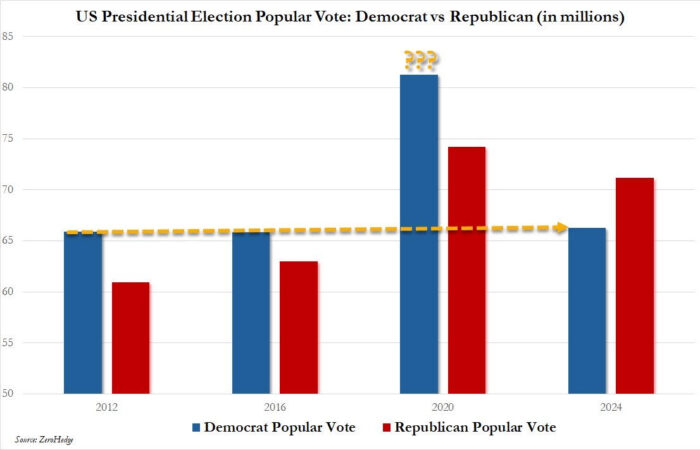
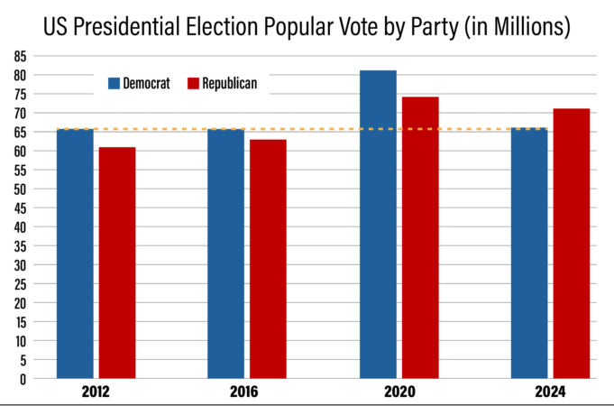
In the Exhibit A graph, the Y axis begins at 50 million, which creates an optical illusion. It makes the fraud look a lot more glaring than it actually was, and does so in a way that is pretty misleading. In the Exhibit A graph, it looks as though Biden’s 2020 vote tally more than lapped Donald Trump’s 2016 vote count. But a quick glance at Exhibit B shows that this is not the case.
Now whoever made the graph could respond by saying that he wasn’t being deceptive, but rather that he was shouting. This anomaly has been obvious to a bunch of people for the last four years, without any graphs, and so he perhaps thought that a graph like this might help focus the attention. But still, the fact that the Y axis starts where it does is misleading. Take care not to be misled. But still . . .

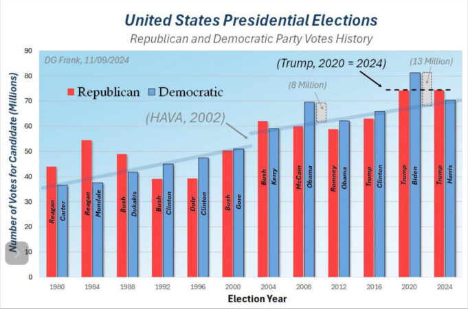
The second qualification is this, and has to do with the blue bar for the election just past. That 2024 vote tally was simply a “to date” vote count. Millions of votes in California were still uncounted, and so that would affect the way the chart looks. So if you were to make this chart five years from now, the dotted straight line running across 2012, 2016, and 2024, would not go straight-line across the way it does now, thus diluting the point. So for an idea of what that might look like, scroll down to Exhibit C. But it would only dilute this point by making another one, which has to do with the ineptitude of modern election management.
So to any argument based on this second qualification I would be happy to reply, “And whose fault is this?” If you want me to count the votes, then maybe you should count the votes. Florida counted all their votes in just a few hours, and the numbers involved were comparable. When I wrote the first draft of this paragraph, it had been three days and California still didn’t know what the heck.

Because I am cynical about such things, I believe the ineptitude is calculated, in that it gives a lot more leeway for electoral shenanigans. It gives people time to discover more boxes of “missing ballots,” as needed. This is why we need to return to paper ballots, which cannot be hooked up to the Internet, insist on Voter ID, and why we need to return to the expectation that we should have a pretty good idea of the total votes cast on election night. The fact that we didn’t for California when the graph was made means that both Exhibit A and Exhibit B are skewed, a fact which is plainly the fault of California.
So Still . . . Manifest Fraud
The Exhibit A graph was so apparently damning that when I first saw it circulating freely on the Internet—always a danger sign—I went back and looked up all the numbers independently. There were a few squishy spots, but nothing that would change the glaring point that was established by the graph, which is that the 2020 election was clearly a fraudulent outlier. This is why the same point is actually made by the Exhibit B graph, only without an unnecessary exclamation point. Even factoring in the Y axis and the missing Californians, the 2020 Biden vote tally remains a true blue comet anomaly.
The 2012 election was Obama/Romney, which Obama won, both in the popular vote and in the Electoral College. 2016 was Clinton/Trump. Trump won the Electoral College, but lost the popular vote, and so was president for that term. 2020, our year in question, with the contest being between Biden/Trump, was a true outlier when it came to that popular vote. And excuse me while I put “outlier” in quotation marks. And then we come to the election just completed last week, between Harris/Trump, where Trump won the Electoral College, and the popular vote.
And with the 2024 graph updated, he has also increased his popular vote numbers over his 2020 results, the first presidential candidate to do this in consecutive elections. And that actually amounts to an increase over the course of three consecutive elections, which is really something.
Now go back and look at the Democratic vote in 2012, 2016, and 2024, and notice the dotted line that was so helpfully drawn across the top of them. That appears to me to be something that I would call the “progressive ceiling”—if we are talking about fair and free elections. That is more or less the number in their base that they can turn out, remembering to factor in the likely increase that is still coming for 2024. Controversial elections can certainly turn out more people, and you also need to budget for population growth, and on top of that you need to remember the massive amount of illegal immigration that has occurred in the last few years. As Senator Kennedy of Louisiana recently noted, over the last four years, we have seen the addition of the equivalent of four Nebraskas, which is one of the reasons why the election went the way that it did.
But with all that said, we are being asked to believe that in 2020 Joe Biden, that basement-bound charisma hole, pulled in 15 million more votes than did Obama, who was still basking in his rock star popularity. It is simply not credible. The Biden family was concerned about his run for the office the first time because his mental impairments were already visible to them. Here are the plain facts. You cannot generate that kind of electoral excitement without being, you know, exciting.
So those Kamala supporters who are claiming that those 15M extra voters were somehow mysteriously deleted from this election need to consider the possibility that they were perhaps, ahem, inserted in the last one. Just a suggestion. And all the states that Kamala won didn’t have voter ID, which some might find curious.
I believe we have enough, in short, to put a permanent asterisk next to the 2020 election. Everybody knows that the 2020 election was rigged the same way we know that Epstein didn’t kill himself. And we should also stop sneering at those who noticed the problem right away.

